VHS HANNOVER
Imagelogo

VHS Hannover Imagelogo
VHS Hannover – Markenerweiterung & Digitalauftritt
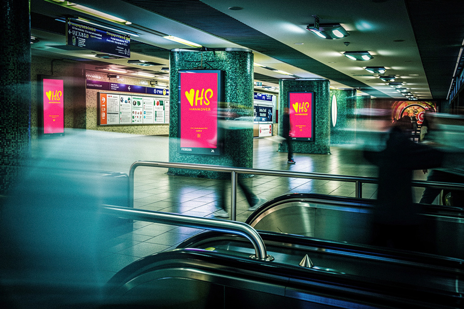
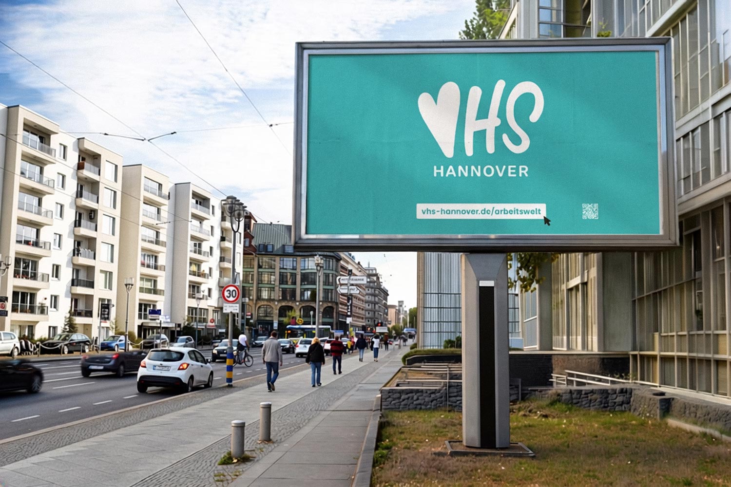
Für die VHS Hannover haben wir eine erweiterte Markenarchitektur entwickelt. Im Rahmen eines umfassenden Corporate-Design-Projekts entstand ein neues Imagelogo als kommunikatives Pendant zum bestehenden Stammlogo. Das etablierte Signet steht weiterhin für sachliche Information. Deshalb übernimmt das neue Logo alle Berührungspunkte, an denen Emotion und Aufmerksamkeit im Vordergrund stehen. Dieser Anspruch zeigt sich bereits in der Formensprache: Das Herz bildet zugleich den Anfangsbuchstaben „V“. Dadurch wird die emotionale Ansprache zum integralen Bestandteil des Signets.
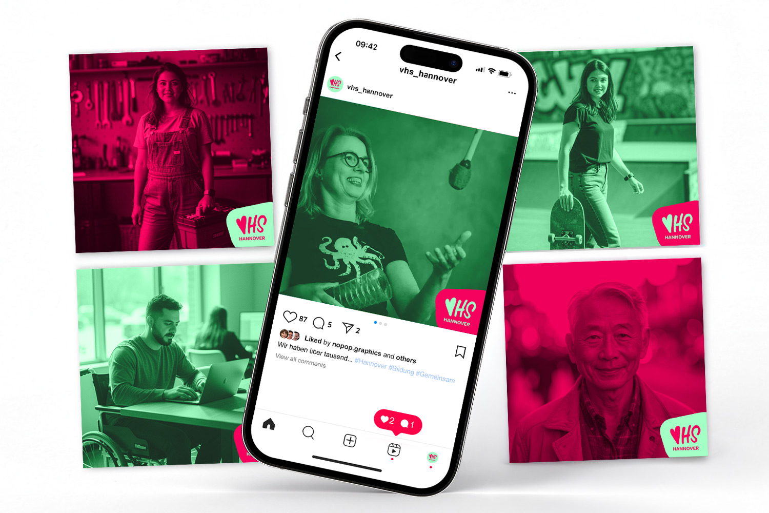
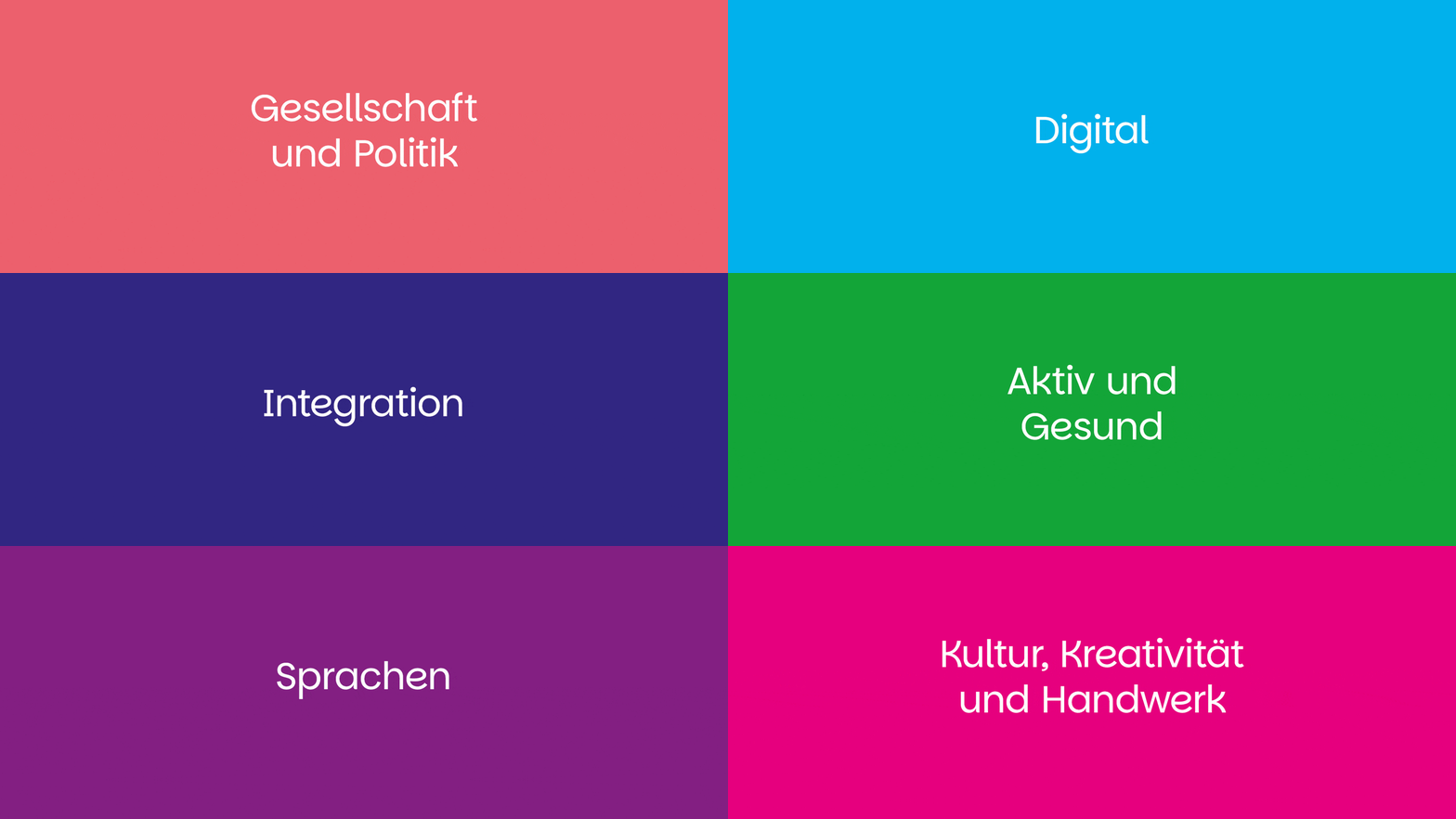
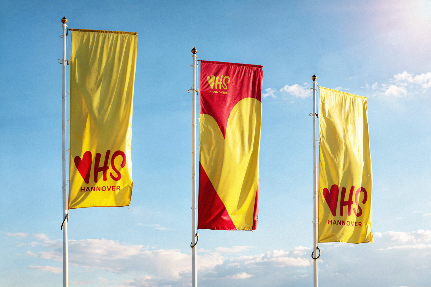
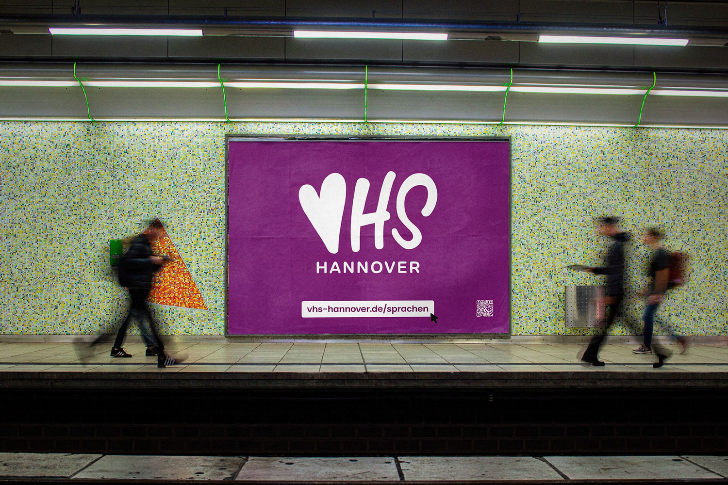
Das Logo ist bewusst minimalistisch gestaltet. Deshalb hebt es sich im visuellen Umfeld ab und funktioniert auf den ersten Blick. Außerdem wurde es für ein breites Anwendungsspektrum und maximale Skalierbarkeit konzipiert. Es funktioniert vom Favicon über das Social-Media-Redesign bis hin zu mehrere Meter großen Plakatwänden im vielbefahrenen Stadtraum. Zusätzlich haben wir die Farbwelten sämtlicher Unternehmensbereiche modernisiert. So bleiben Wiedererkennungswert und Markenkontinuität erhalten, nah genug am Original.
Kunde:
vhs-hannover.de
VHS Hannover – Brand Extension & Corporate Design Update
For VHS Hannover, we developed an expanded brand architecture. As part of a comprehensive corporate design project, we created a new image logo. It serves as a communicative counterpart to the existing primary logo. The established mark continues to carry factual information. Therefore, the new logo takes over every touchpoint where emotion and attention are the priority. This idea is already embedded in the form itself: the heart doubles as the initial „V.“ As a result, emotional appeal becomes an integral part of the mark.
The logo is designed with intentional minimalism. Therefore, it stands out in its visual environment and reads instantly. Additionally, it was built for a broad range of applications and maximum scalability. It works everywhere, from favicon to social media redesign to multi-meter billboards along high-traffic streets. Furthermore, we modernized the color palettes across all business units. This keeps recognition and brand continuity intact, staying close enough to the original.
Client:
vhs-hannover.de